BellyUp! illustration style guide
BellyUp! Storybook Architecture
Version 1.0
Start with the real building. Keep what makes it recognizable. Then push the shape until it feels like it belongs in a storybook.
The working examples
Two buildings, one visual language
The Buoy stretches the whole building. Hard Pressed tightens the lesson to one storefront. Together they show how far the drawing can move while the place stays recognizable.
The Buoy, before and after
The first complete BellyUp! Storybook Architecture example shows how far the perspective can move without losing the building.
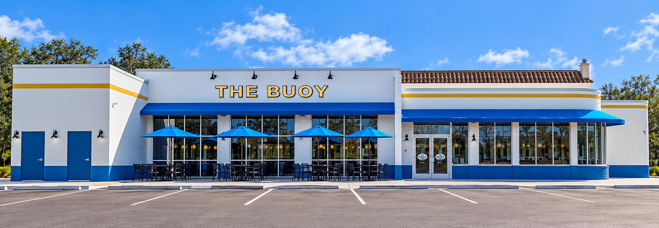
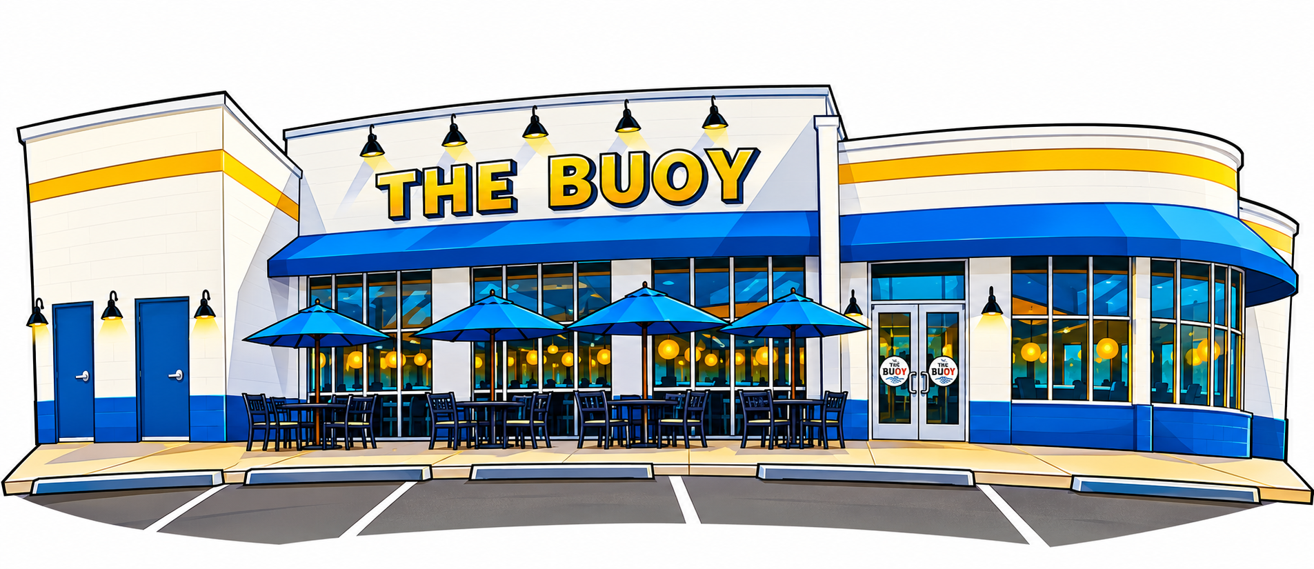
What changed without changing the building
- The sign, blue awnings, yellow stripe, white walls, doors, windows, patio, and curved right wing still identify The Buoy.
- Cars, trees, sky, utility clutter, and neighboring distractions are gone.
- The wings bow outward and the front takes on a playful curved perspective.
- Repeated windows, tables, chairs, lights, and pavement lines are simplified into clean shapes.
- Bold outlines and saturated blue and yellow make the building read immediately.
- Subtle shadows add depth without turning the drawing into a realistic rendering.
Hard Pressed Burgers, before and after
Hard Pressed packs nearly all of its personality into one tight storefront. The drawing pushes the curve and the drama without borrowing anything from the buildings beside it.
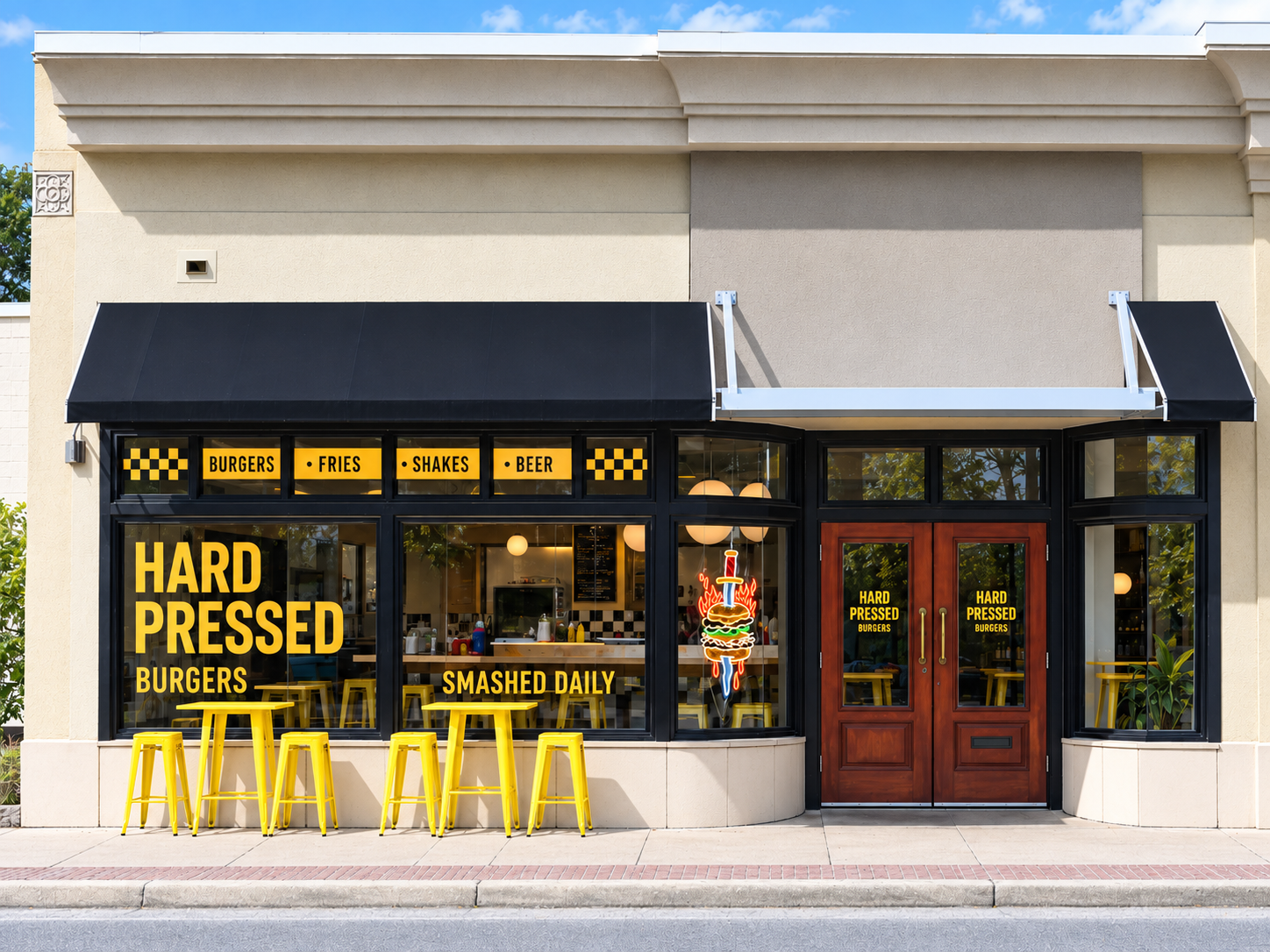
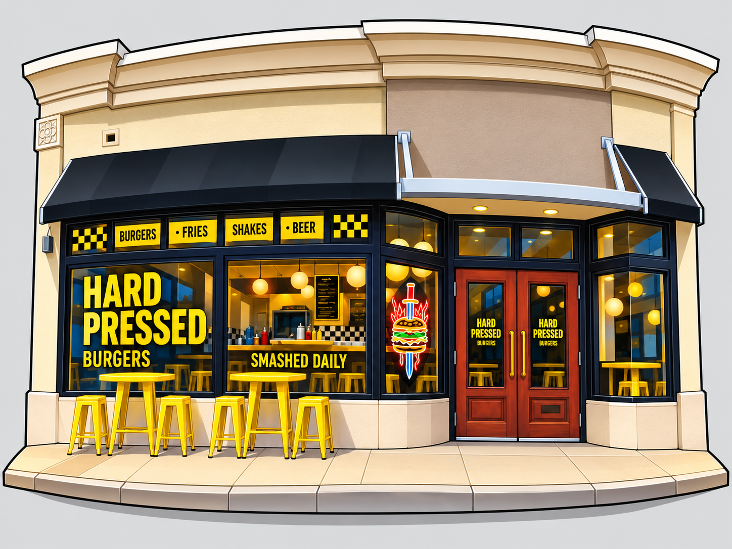
What changed without changing the storefront
- The yellow-and-black signs, red doors, black window frames, cream walls, awnings, stools, tables, and burger sign still identify Hard Pressed.
- Trees, sky, reflections, landscaping, and the neighboring storefront edges are removed.
- The roofline and glass storefront bow forward while the outer walls curve inward around them.
- Interior equipment and reflections become cleaner blocks of warm light, color, and shape.
- The signs grow bolder and the black, yellow, cream, and red palette does more of the storytelling.
- The close storefront still reads as architecture, not a logo pasted onto a generic building.
The reference collection
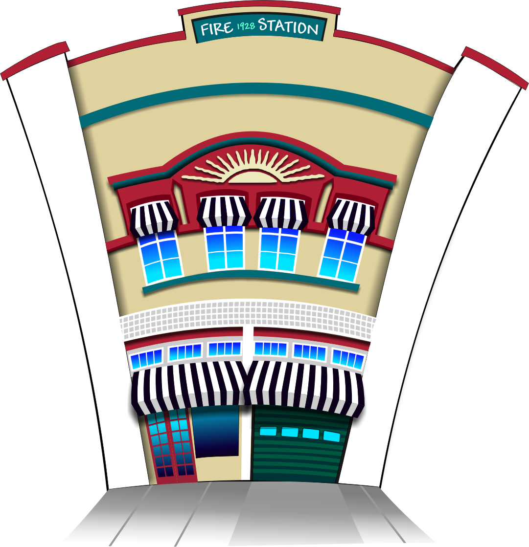
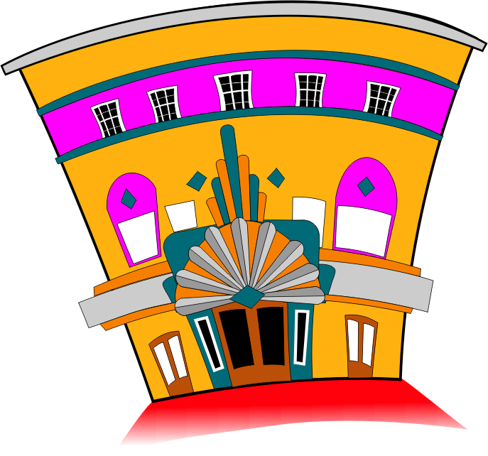
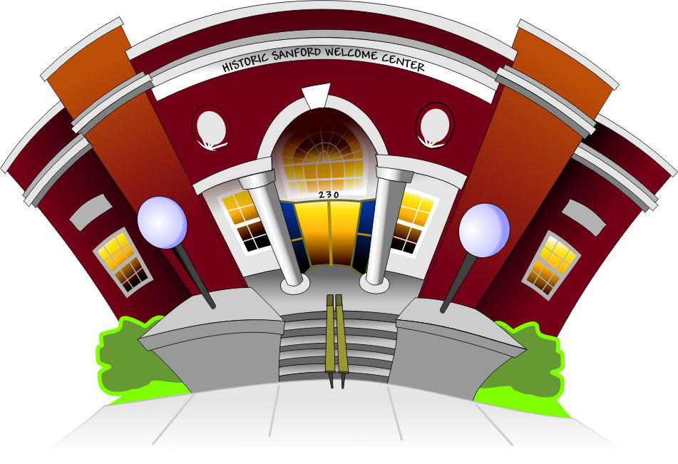
Three drawings that define the visual DNA
These earlier building drawings establish the exaggeration, curvature, saturated color, clean white background, and traceable geometric shapes the BellyUp! style carries forward.
The non-negotiables
How to draw the next building
Preserve the identity
- Keep the building's signage, colors, windows, entrances, and defining features.
- Make sure someone who knows the place can still recognize it immediately.
Push the personality
- Exaggerate the wings and perspective.
- Use playful curves, bold outlines, saturated colors, and subtle dimensional shading.
Clear the building
- Remove cars, people, trees, utility poles, and anything else blocking the architecture.
- Do not incorporate neighboring buildings.
Simplify, do not invent
- Simplify repetitive details while preserving the original character.
- Do not add doors, windows, signs, rooflines, or other architectural features that are not there.
Finish for reuse
- Keep the entire building visible on a white background with minimal foreground pavement.
- Build clean, traceable shapes that can be recreated or refined in CorelDRAW.
The reusable prompt
Copy this for the next restaurant
Attach the restaurant photograph and the three reference drawings, then use this prompt as the starting point.
BellyUp! Storybook Architecture ... v1.0

Transform the attached restaurant photographs into a BellyUp! Storybook Architecture illustration.

Style:
Playful architectural caricature inspired by hand-drawn vector illustrations, with curved perspective, bold outlines, saturated colors, simplified geometric details, and subtle dimensional shading.

Architectural rules:

- Preserve the building's identity, signage, colors, windows, entrances, and defining features.
- Exaggerate the wings and perspective for visual personality.
- Remove cars, people, trees, utility poles, and visual obstructions.
- Do not invent architectural features or incorporate neighboring buildings.
- Simplify repetitive details while preserving the original architectural character.

Composition:

- Primarily front-facing, with playful curved perspective.
- Entire building visible, including both wings.
- White background.
- Minimal foreground pavement.
- Clean, traceable shapes suitable for CorelDRAW.

Output:
A high-resolution, polished architectural illustration consistent with the BellyUp! Storybook Architecture reference collection.
The final check
A finished illustration should pass all five checks
- The real building is immediately recognizable.
- The full building and both wings are visible.
- Nothing important was invented or borrowed from a neighboring property.
- The perspective feels playful without becoming distorted beyond recognition.
- The shapes are clean enough to trace, edit, and reuse.